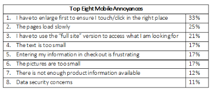
 Based on the survey here are the biggest complaints that consumers had about shopping on mobile devices.
Too much mis-clicks with the given screen size
One of the most concerning things for shopper while shopping online through mobile is they can’t simply click the right thing without enlarging the screen and that there is too much of pinching and zooming required or it will end up with mis-clicks. But, the idea is there are some very good solutions that the brands might be unaware with such as image padding, easy scrolling and so on. For instance, if a button or an image is clickable and has a link to another web page, try putting a few pixels of “padding” before the link actually becomes functional. Moreover, as mobile shopper scroll more than they make clicks, ensure the web experience supports scrolling on the mobile sites as well.Lengthy loading time and slow loading speed
Whether it is the web experience on desktop or mobile a very slow loading speed is one the main reasons behind a high bounce rate. So, like you had to work on the remedies to fix the slow loading speed in case of desktop you have to do in mobile as well. It’s not that it is unavoidable how ever there are a few things that need to paid attention such as the size of media files, images & so on. Try to reduce the image file sizes on your mobile sites if any and alter it to the exact size to fit the page as this will significantly reduce the loading time of your mobile web page. However, at the same time ensure your images to support the zoom feature and obviously it is available in most of the cases.The undersized text
A mobile website that contains text that is too small to read isn’t a rare issue and that it is one of the most unrelenting complaints made by mobile shoppers. I don’t think it is wise at all to lose customers because they were fade up squinting to read the minute content on your mobile site. Instead, it is better to do some hard work and change the text if they have some issues such as very small size, too light or not in contrast with the background to be identified easily. Try to have larger text no matter whether fewer but meaningful. Ask yourself before putting the content on the mobile site that “how can we communicate the same stuff in fewer words?”Help consumers avoid typing as they don’t like
I mean we all are same at the core! Like you and I find it daunting to type on mobile, our customers don’t like it as well. Help them get the right option so that they need not type the whole thing. Try to include smart search option at your mobile site giving auto-suggestions and help them get it done without even getting to type. Studies have found how solutions such as Google Wallet, PayPal and more substantially reduce the check out time and happen to be a great time saving tools for customers, for they allow the consumers to have a smooth shopping without having to type the same thing over and over again such as entering the credit card & address information at every purchase.Too small image to be viewed properly
For your product images are very crucial for online shoppers as this is how they can judge whether the product is a right fit for them or not, you must work properly on your images. You can’t just overlook the main attraction of your ecommerce business i.e. the images. Try to have not more than 4-6 images on one web page or say on the same screen as that will make the images to look too small to be viewed properly.Lack of product information
I know we cannot have the entire story o such small screens still we cannot even miss out to the information that were crucial for your consumers. Yes! It has to be crisp but meaningful as well! While trimming down the content copy on the homepage & category pages for freeing up the precious space on the mobile screen, never compromise your product copy and never eliminate or reduce the product details for space. You can always make use of calls-to-action like “click for more” after offering a teaser if you have limited real estate on your product page. Moreover, you can also think about segregating your product description into tabs such as description, details, return policy & so on.Remind the consumers of the data security
Though ecommerce is on boom still there are a number of customers who are still uncomfortable sharing their sensitive data on mobile web, for it’s a fact that public data breaches happen if not quite often. So, ecommerce brands must remind the shoppers consistently that their data is safe and should also present them with secure payment systems like PayPal and Google Wallet wherein shoppers don’t require entering their personal details. Make use of the terminologies like “enter secure checkout” throughout your mobile website and keep offering further information about your security measures to the customers ensuring your customers to be well aware of your sites security measures.Afterword
Utilize the great platform that digital marketing revolution has bestowed you with. Realize the fact that of course the ease of access even when one is on his move has made mobile a great medium for shopping however at the same time there are a few things compromised by the size of the device that leads to frustration in terms of user experiences. Try diminishing these factors by improving the way information is accessed and displayed, at least till the time technology provides you more flexible options.


