
Beaglecat
 Using bold colors but a very simple design, Beaglecat has tried to give visitors a lot of valuable information through its mobile homepage in a very precise manner. Consuming very less space they have given the users an overview of their mission, their value proposition and their team members and have employed a few big call-to-action buttons that say learn more, more details & so on for describing these further. The best part is, they have made use of really very short forms that are very easy to fill out on a mobile device.
Oakley Hall Hotel
 While booking a hotel online, what are the main things we enquire about? May be how do the rooms & spaces look, the availability of the room and the pricing information! Isn’t that? This is what Oakley Hall has taken care of presents the visitors with big, high-definition images as well as a mobile-friendly availability feature with pricing options. The brand has also tried to describe their room styles precisely allowing the users to learn more about weddings & their exclusive dining club at the same time through their call-to-action buttons.
Impact Branding & Design
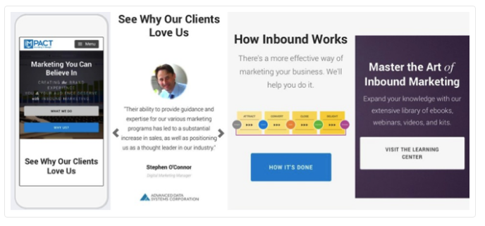 The mobile site by Impact presents an illustrious blending of multiple components of the value proposition into one, to the point scrolling page. They help the users to learn more about what they do and what they offer through easy-to-click buttons. They also present users with the customer testimonials along with a graphic on what inbound marketing is apart from the big call-to-action button that links to their learning center.
Speckyboy
 A design blog, Speckyboy presents its visitors with a flawless scrolling experience along with captivating imagery as well as article titles in large fonts and a very readable introductory paragraph that tease each article and can be clicked to read the rest of the article. They have also done a marvelous job for lead capture by providing a mobile-friendly form soliciting subscribers to their newsletter. They have tried to make it more engaging by presenting two separate lists of historic blog posts that say “Most Popular” and “Recommended towards the bottom of the homepage for users to click.
Landscape Leadership
 Landscape has done a great job in helping the visitors connect directly to the firm instantly by presenting a press-to-dial phone number on its mobile homepage. The way they have placed the call-to-action for calling is really appreciable. Then the site talks about what they specialize in along with valuable content for the visitors that include big, easy-to-press social media buttons, website links and blog articles. They also have a large search box at the bottom for helping the visitors who want more information.
SyncShow
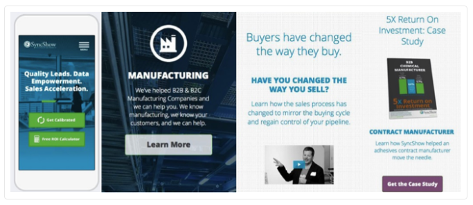 SyncShow have again tried to have a very clear and succinct mobile website. They straight away offer can’t-miss call-to-action buttons along with a full description of their target market as well as the B2B & B2C manufacturing companies. There is the concise elucidation on how the manufacturing industry’s changed the moment users scroll down adding more value to the site as the information is really very important for their target audience. Then they have also talked about their value proposition along with the case study highlighting a recent 5X return on customer investment.
NudeAudio
 A company that sells portable speakers, NudeAudio has done a tremendous job with its mobile homepage by proving the visitors with the exact information they were hunting for. The site is comprised of outstanding product imagery along with feature details as well as big call-to-action buttons. They have these product-update links on their mobile homepage that send people directly to their blog. Moreover, they offer a one-field form helping visitors to register for newsletter by entering their email address.
Influence & Co.
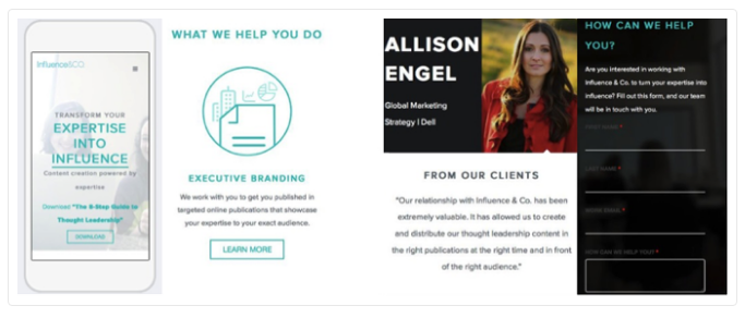 Influence and Co. have done it a little differently! They have a very compelling, alluring and comprehensible value proposition near the top of their mobile homepage that says- “We work with you to get you published in targeted online publications that showcase your expertise to your exact audience.” To add value to their website they have showcased a visual testimonial from Dell apart from offering a very precise, user-friendly form helping the prospects to quickly leave their contact information.
1252 Tapas Bar
 Again! 1252 Tapas Bar has done an illustrious work whne it comes to a mobile website particularly meant for food & baverage business. Their complete menu is designed to be mobile compatible and that you need not pinch or zoom anything again & again before deciding on what you want. To make it a little more engaging & gripping they tell an appealing story about their head chef, Wes Tyler on the homepage itself giving a very welcoming feeling to the restaurant.
With everything already at place, users really love their special offering at the bottom of the page that talks about 1252’s weekly food-and-drink specials.
Again! 1252 Tapas Bar has done an illustrious work whne it comes to a mobile website particularly meant for food & baverage business. Their complete menu is designed to be mobile compatible and that you need not pinch or zoom anything again & again before deciding on what you want. To make it a little more engaging & gripping they tell an appealing story about their head chef, Wes Tyler on the homepage itself giving a very welcoming feeling to the restaurant.
With everything already at place, users really love their special offering at the bottom of the page that talks about 1252’s weekly food-and-drink specials.
TrendKite
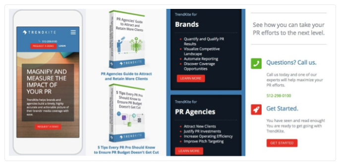 How about accommodating all the goodies of a desktop website on a mobile one? This is what TrendKite does! Starting with a pleasing visual above the fold, their mobile homepage presents their value proposition & contact information one by one. Users are able to download their ebooks and fetch more information catered specifically to them once they scroll down. The site has segregated the content ‘For Brands’ and ‘For PR Agencies’ apart from having the well-placed call-to-action buttons throughout.
So!
Your website can be accessed anytime, anywhere on any device! Be prepared for it! After all you can’t compromise with your business and never forget your website is the gateway to your business through which you get more customers! You never know who is viewing your business where on which device. Don’t give a bad impression to anyone even in the worst case. Get your website compatible for all devices!


